What colour is your brand?
While we may often take colour for granted, keeping it in our peripherals in favour of catchy slogans and evocative shapes within our logos; when it comes to brands, colour can be the first flicker of an emotional response, and the lasting memory that lingers in your mind's eye for years to come.
Fact: test takers score better, and weightlifters lift more when in a blue room. Why you ask? It all comes down to the psychology associated with colours – blue typically incites clear thoughts, focus and relaxation, all ingredients which are integral for helping you ace your exams or bench more.
But the psychology behind colour is more effective than merely improving your grades or growing your muscles; it’s an integral part of expressing your brand identity and the attributes and values that that identity is hinged upon.
While we may often take colour for granted, keeping it in our peripherals in favour of catchy slogans and evocative shapes within our logos; colour can be the first flicker of an emotional response, and the lasting memory that lingers in your mind’s eye for years to come.
So just what makes colour so important for articulating your brand? With so many colours to choose from, it can seem a daunting task and you may find yourself staring at a blank canvas for a long time. So to help, we’ve taken a look at some easily recognisable brands who have capitalised off colour, and we hope that it will give you some inspiration and insight to help your brand form a more colourful, and most importantly, clear picture of itself.
But before we start, we need to go back to where it all began, with the invention of the wheel.
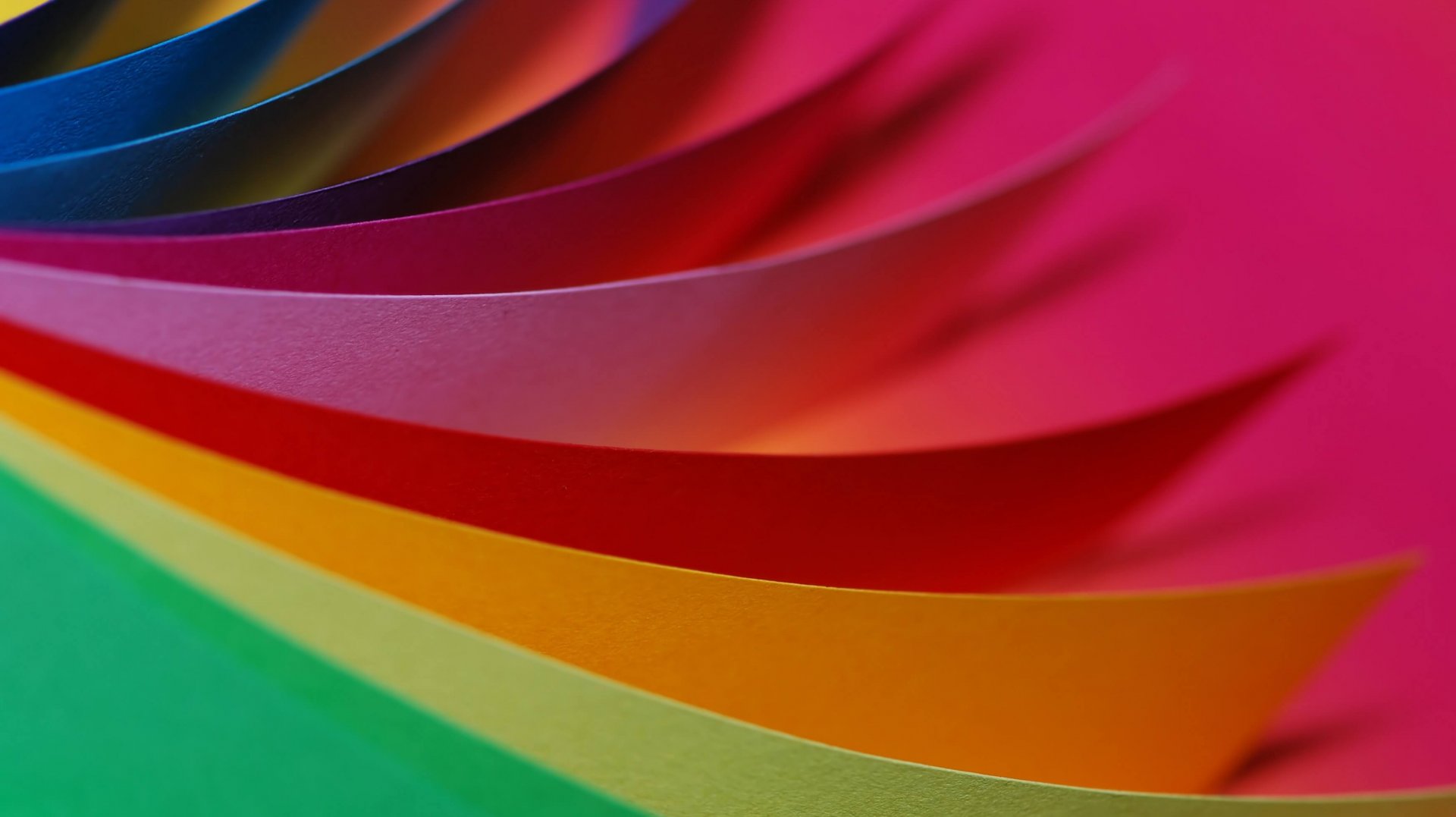
Understanding the Colour Wheel
Before we get too carried away with matching colour to personality, it’s important that you start with clear direction, and the best way to steer yourself towards articulating your brand is with the colour wheel.
At a primary level, we have blue, yellow and red.
Blue is often referred to by marketers as the most popular colour worldwide due to its calming and sedating effect symbolically related to the ocean and the sky. But beyond this, blue has been known to speak loads about qualities such as professionalism, reliability and strength, and as such, it’s a favourite of tech companies and financial institutions.
If passion and stimulation is the desired effect you’re hoping to have on your audience, then red is where it all begins. Other feelings and associations derived from this colour include excitement, love and hunger. It makes sense then that so many of the call to action buttons and sales signs we see are typically displayed on a red background.
When it comes to looking on the bright side, you can’t look past yellow. Inherently cheerful, yellow typically conjures feelings of optimism and happiness and is a favourite for marketers when trying to capture the attention of children as well as their parents (they’re the ones with the cash at the end of the day).
Mixing these colours results in the secondary colours of green, purple and orange, and from these we get our tertiary colours; teal, violet, chartreuse, amber, vermillion and magenta.
Typically, as we add more shades, we get a more varied and deeper representation of brand identity. Additionally, pursuing a unique shade of colour is instrumental in making brands stand apart from one another.
So just which brands have capitalised off colour well? Below are some of the most easily recognisable uses of colour on the market:
The Blues
What do Oral B, IBM and American Express all have in common? They’re all dependable brands. When we think oral care, we think dentists. Some of you might get a shiver up your spine just thinking about the sound of the dental drill, and as such, taking care of your teeth requires a brand that is trustworthy enough to save you from the dentist’s chair. The same goes for IBM – computers and technology are a big investment for both home and work, so you want to make sure that you can depend on picking the brand that won’t fail. And when it comes to making a purchase, you want to make sure you’re using a card that won’t let you down – wait…you don’t accept American Express? Mmm…maybe blue isn’t the best choice for AmEx afterall.
The Mighty Reds
While red has been known for evoking feelings of passion and stimulation, it’s also renowned for being bold and youthful. It’s no wonder then that it’s the colour of choice for Coca-Cola, a drink that may as well be a bottled elixir taken from the fountain of youth, what with the brand transcending time to remain a contemporary favourite, bolstered by ads typically depicting young adults living up their best days, a glass bottle of the good stuff in hand. This shared boldness and youthfulness is again seen in brands like Nintendo and childhood staple Lego. Both brands are known for their big game changing ideas and reinvention, staying up to date over the years and always showing off their youthfulness.
Mellow Yellow
They call it mellow yellow, and when it comes to the psychology of colour, this doesn’t stray too far from the mark. Warmth, optimism and clarity are all emotions commonly associated to the colour yellow. Swedish furniture retailer, IKEA chose the colour wisely; after all their business is built around making customers optimistic about the kind of life they can assemble for themselves one flat-pack at a time. When it comes to warmth, nothing speaks it better than McDonalds whose use of yellow could be said to evoke feelings of comfort, happiness, and the kind of warmth you get from childhood nostalgia. And who needs to instill feelings of optimism more than the Yellow Pages? The use of yellow subliminally lets readers know that they don’t need to worry, that they will find what they are looking for when it comes to finding the right person for the job.
But before you go and start playing around with colours…
While it’s easy to say that a colour could align with a particular trait, nearly every academic study on colours and branding states that it’s more important for colour to support the identity that you are trying to create, instead of using colour to align with common colour associations.
So what’s the point of interpreting colour you ask – well, it’s important to know these common colour associations in order to bolster what you already know about your brand. The first step shouldn’t be to look at colour and try and fit the mould – you need to first consider your brand identity. If you try to add just about every colour (and its associated meaning) to your brand, you’ll end up with that same muddy colour – confusing and unclear.
If you are struggling to get a clear picture of your brand’s identity, or feel like you could be articulating that identity better with a more appropriate colour, we’re here to help, so get in contact with our colourful team of creatives today.