Brutalist web design: a love-hate relationship
As lovers of UX and CX friendly websites, we at JSA tend to steer clear of design principles that fail to tick these boxes - but that doesn’t stop us from taking great satisfaction in looking at some of the sites that have given the proverbial middle finger to user friendliness.
In the same way a hot rod sticks out like a flashing beacon on the road among the sleek new eco friendly rides that we are so used to today, websites that buck conventional UX trends are sure to make heads turn.
Lings Cars is probably one of the best examples of pure UX anarchy, and if you haven’t already heard of it, you’re going to have a fun few minutes checking it out for the first time. Whether you call it an LSD nightmare or a masterpiece of retro art, the site has worked phenomenally as a publicity stunt, garnering business for the UK based car leasing extraordinaire to the tune of hundreds of millions.
While Lings Cars is truly a one of a kind case study in web design, it does share some similarities with a design trend that is causing some to cringe in pain and others to go in the hunt for more. I’m talking about Brutalism.
Brutalism is an interesting design trend that has managed to keep on kicking over the last few years, and as a UI and UX designer, I guess you could say I have a bit of a love-hate relationship with it.
In a nutshell, my UX brain hates it as it goes against what modern design principles are, but my UI brain likes it as it goes against the status quo.
For those of you that aren’t acquainted with brutalist web design, it can best be summarised as raw, unordered and chaotic. Want to put pink with grey? Go for it. Have an image cover half your page’s text? Sounds good. Make navigation nearly impossible? Now you’ve got it.
Don’t get me wrong here – while it’s easy to turn up your nose to what sounds like a 4 year old putting together your website; done correctly, a brutalist website can be highly effective.
But first –
Know your audience.
Brutalist design (as you can probably imagine) is not for everyone. It’s design language speaks to the unconventional, being unrestrained and provocative. It’s worked well for brands such as Bloomberg (a more modest take) and Yale’s University of Art (definitely more extreme). There’s an edginess to both that goes with how they want to be seen, and who is likely to be frequenting their material.
Make sure your purpose is fulfilled.
A website is an extension of your brand, and as such, make sure that your purpose – whether it be to make a statement, to disrupt, or to sell products etc. is being fulfilled.
Be inspired, but stand apart.
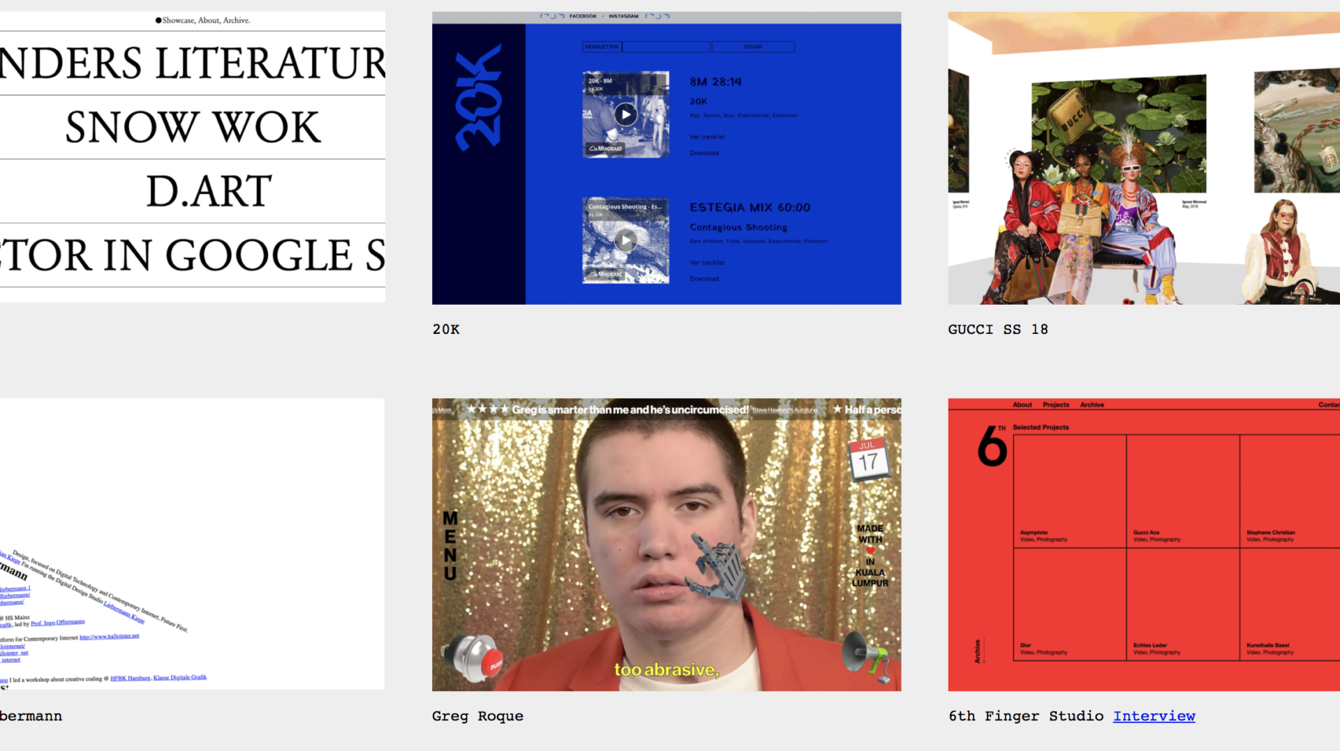
There are a lot of great examples of brutalism online already – many of which you can find at the aptly named brutalistwebsites.com. If you are going to take a brutalist approach, there are plenty of creative examples to draw from, but remember that you are extending your brand’s personality to the 110th degree – so it deserves to be unique. Don’t be afraid to push the boundaries. Take for example comedian Greg Roque’s site – this one definitely drew a few looks to my screen when i had it up, check it out for yourself and you’ll see why.
Aaron Lepik is the lead UI / UX designer at JSAcreative. If you are interested in design that still stands apart from the pack, but has a strong focus on UX and CX, get in touch with us today.