Our relationship
Brisbane is home to a number of masterpieces in architecture and locations brimming with culture – but how many of us have seen what lies beyond lock and key? Our ongoing partnership with Brisbane Open House has allowed us to use digital and print to paint vibrant portraits of some of the city’s most iconic addresses, creating a community event that has spanned nearly a decade.
Building the brand
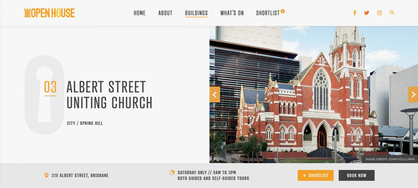
We have been the caretakers of the Brisbane Open House brand, refining and articulating it across collateral. As early partners, our involvement began with the creation of the current logo and has continued across print and digital assets including the guidebooks, pocket maps, website and a range of downloadable digital assets for participating buildings.
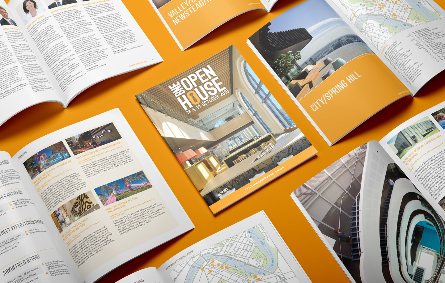
While the temptation of discovering what lies beyond closed doors is incentive enough for most, the guidebooks go above and beyond, packing in great activities including walking tours, special events and concerts.
In addition, the pocket guide and map have been designed as a handy companion for attendees featuring a list of locations which were also plotted on a custom vector map using the signature orange house icon. Curated events have also been included into the 2018 pocket guide to ensure attendees make the most of the event.


Digital
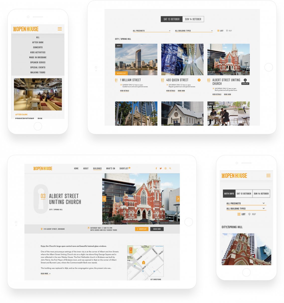
The look and feel that was adopted for print assets has been bolstered via digital as well, with a website refresh taking place in 2018 that sees the visual language having a stronger presence than the previous site design.
Keeping consistent with the guidebook, the new website experience features the same iconography, fonts and colour pallette to again reinforce the brand and generate recall across channels. This is especially evident in the mapping feature which mirrors the design of the pocket fold out map, but comes with the added benefit of filtering by precinct and displaying which days the buildings are available for viewing.
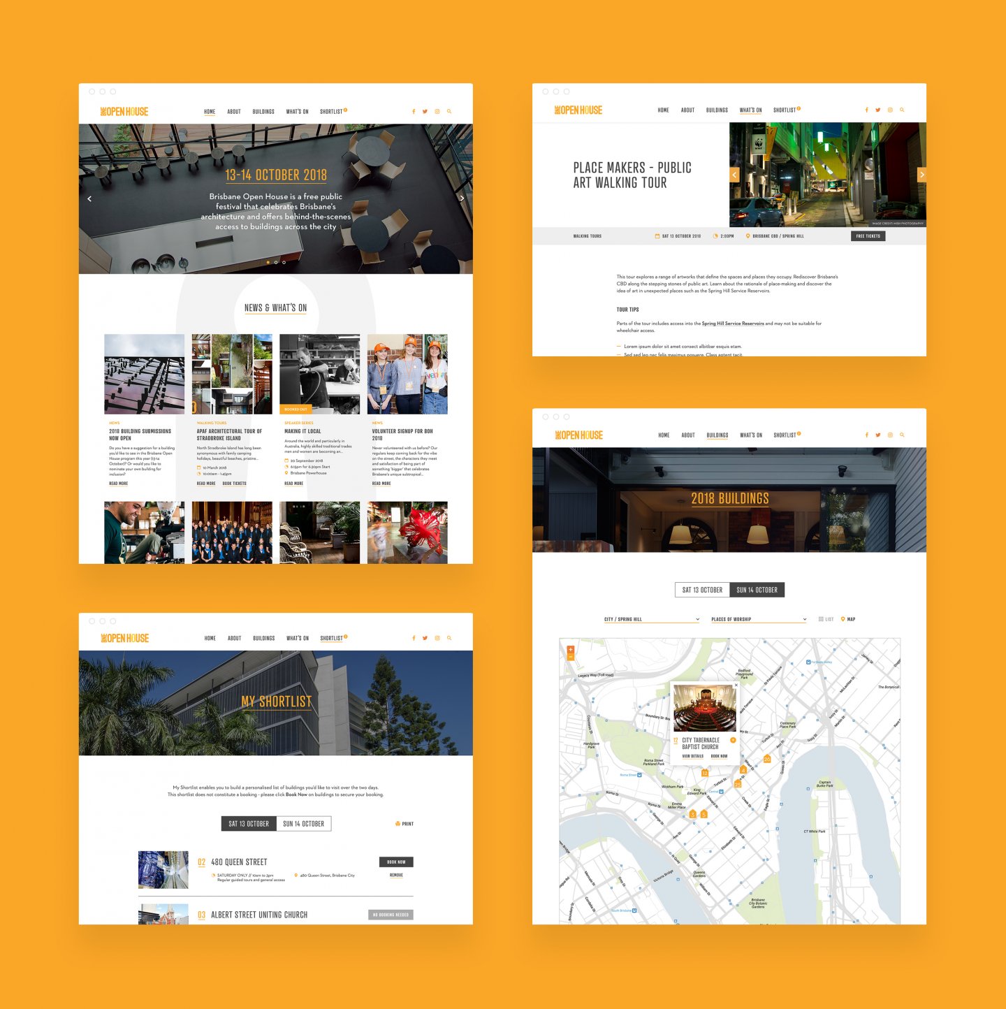
From a content perspective, the site was designed with a modular approach to provide ease of customisation, setting the direction for upcoming years and ultimately creating longevity. With listed buildings changing each year, site administrators have been empowered with the ability to simply export the list of locations to a spreadsheet, where they can be updated for the next year and re-imported.
In regards to UX design, we sought to enhance the users experience before and during their visit to some of Brisbane’s most iconic locations by first improving the site experience. After reviewing user behaviour on the old site, the menu structure was improved to ensure key areas of the site are easier to find, and a greater focus has been placed on simplifying the planning process, with the ability to ‘favourite’ locations and ultimately build out the user’s itinerary, complete with directions and opening times, at the click of a button.
The outcome
From launch of the new 2018 website on September 11 to this year’s event, the site received strong engagement with 387,090 page views across 85,171 sessions by 52,209 users. On average, users spent 4.5 minutes on the site looking at 4.5 pages, indicating a strong and ongoing interest in the event. Attendance to the weekend has increased YoY as well.
With the website being built on WordPress, API integrations have allowed for the possibility of a dedicated app in the future, further enhancing the Brisbane Open House brand and the sense of community around the event.