The Challenge
Since its beginnings, Mater has had a strong and proud tradition of servicing unmet needs in the community through a number of different ministries that have extended their services throughout the years. However, while the varied business units which sat within these ministries were known internally; to the public, Mater recognised that they were primarily seen as a hospital service alone.
In order to bring their ministries of health, research, education, and foundation (their donation arm) into the spotlight, they required an extensive investigation and re-evaluation of their brand.
Our Solution
01 : Strategy
All good work begins with a solid strategic background. We started the strategy process with qualitative research to tease out our initial findings. Following this, we moved into quantitative research, interpreting numeric data to find trends in attitudes and behaviours. During these two phases, we conducted a range of work that included focus groups, audience questionnaires, online surveys, face-to-face interviews and telephone interviews, as well as brand workshops with key stakeholders both internally and externally.


It was this research that informed our approach to creating a new Mater Group brand strategy, sitting atop the other business ministries. As such, we provided Mater with a new group brand framework that honoured their past while giving clear direction for the future, repositioning them as a health group, beyond the confines of being just ‘a hospital’.
Within this, we fleshed out a proposition framework that spoke to the core of what Mater stood for today across their brand purpose, story, idea, values and personality. The brand strategy painted a clear picture of their story and purpose and this carried through to an overarching idea of the Mater Group as a ‘health partner’ that helps busy Australians live life to the fullest, by supporting them to make better choices about health each day. To bring brand clarity to the ministries of health, education, research and foundation, we conducted an extensive brand architecture piece, gaining a clear perspective of the hierarchy, aligning all the individual business identities within their respective ministries to establish a linear structure that harmoniously sat under the overarching Mater Group.
Finally, we conducted an extensive focus group testing process for both early shortlisted concepts and the finalised designs to ensure our brand design and strategy aligned with the organisation.

02 : Building the brand
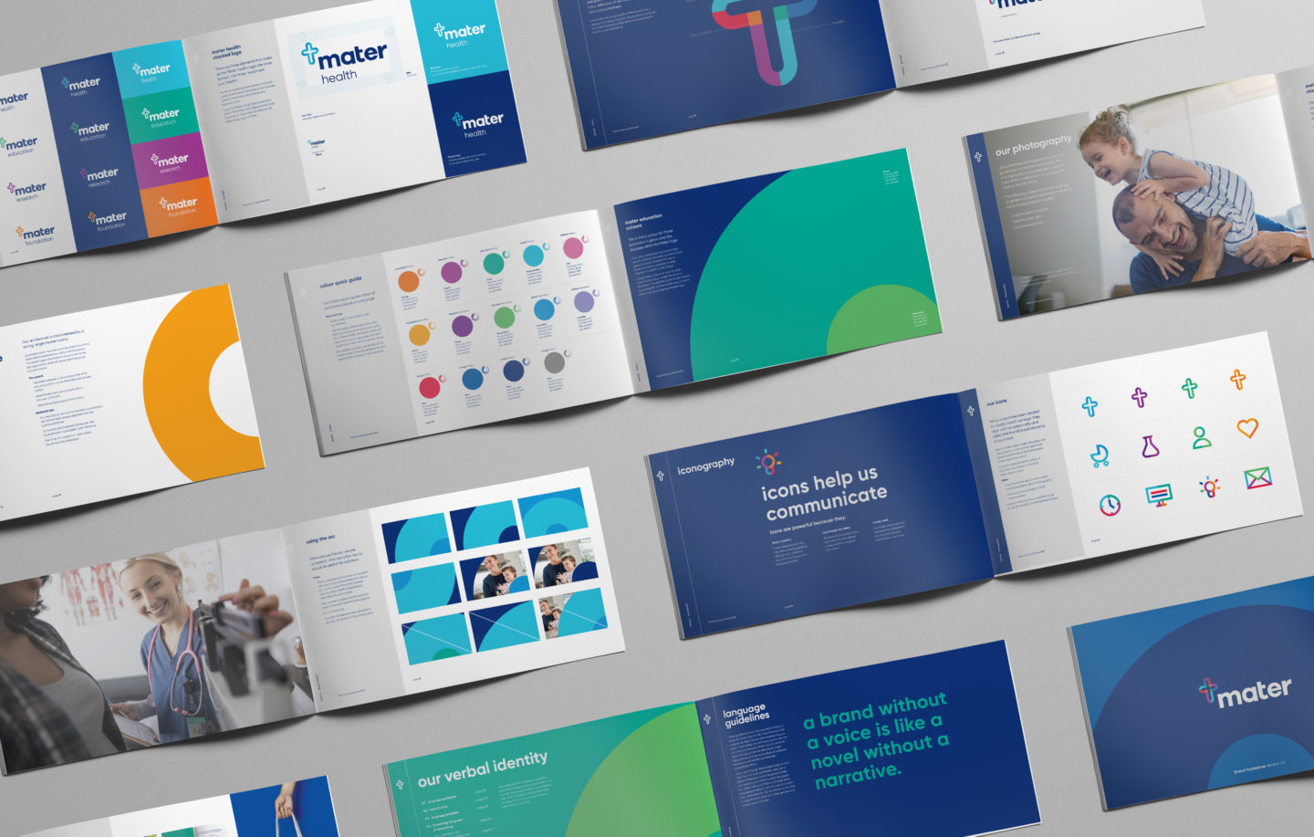
We crafted a new logo for the Mater Group that acknowledged the heritage of Mater as well as its future. The new logo depicts a stained glass cross, inspired by the stained glass from the original buildings of the Sisters of Mercy. The differing colours that frame the cross represent the group as a whole, as well as the four ministries, each with their own individual colourway, working together as one united group.
The second element of the logo is the Mater ‘wordmark’ which when combined with the cross creates a tie between the past and the future. It is a bespoke wordmark that is modern, purposeful and carries itself with gravitas; designed to be legible across both print and digital.


In addition to the logo, we created a complete brand look and feel that incorporates an ‘arc’ effect which was taken from the curved ends of the cross in the logo. The result is a modern and striking brand, utilising the group navy colour as an anchor and cleverly waterfalling down to create identities for the four ministries. The curves are soft, positive, and calming; further echoing the brand personality traits.
The new brand was rolled out across the full extent of collateral. This included cars, stationery, wayfinding, signage, uniforms, lanyards, POS materials, annual reports, large and small format brochures, magazines, social templates, eDM’s and of course the new Mater group website.


Inconography: Additionally, we crafted a large suite of bespoke iconography for Mater that help to identify features and carry the story across the brand and the new website.
The final piece in the puzzle was the Brand Identity Guidelines. With many different business units and ministries involved, we gave each the guidance to adhere to the overarching brand. This encompassed a visual, digital and verbal identity that would ultimately create a sense of unified culture. The verbal identity encompassed tone of voice and language principles that express the brand’s essence and speaks to their audience by relating to them with energy, enthusiasm, care, and authenticity. Their verbal identity stands out from competitors by emotionally connecting and conveying partnership across a range of channels.

03 : Website development
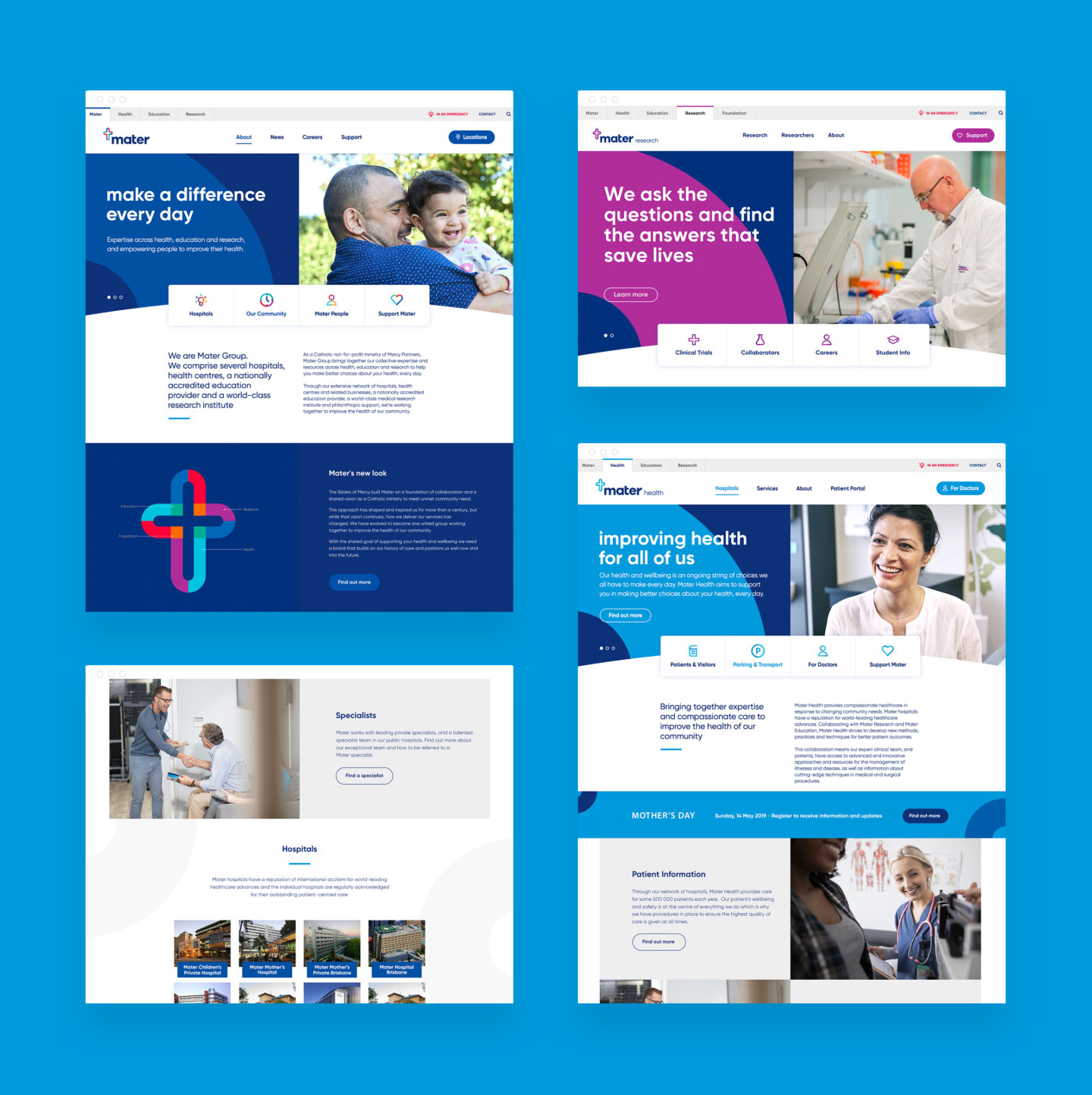
Carrying the rebrand across into the digital space, we proposed an update to the old Mater website. As realised during the strategy process, we knew there was a need to consolidate their ministries and business units, each of which had their own separate website requiring admin and support.
We began designing a new ‘group’ site that utilised a modernised UI that reflected the new brand. We also took into consideration each ministry and business via a highly complex, yet intuitive navigation structure. This allowed for users to toggle between the main Mater group view as well as views for the ministries of health, education and research, each of which had their own menu structure.

We developed the HTML, CSS, and Javascript in a manner that allowed for modularity, customisation and reuse on a page-by-page basis. This created a front-end system that was simple to build on, enabling Mater to quickly add new pages and additional content into the future. We also optimized for responsiveness so content could be consumed on virtually any screen size or resolution.
The back-end is built on Mater’s existing CMS of choice, Kentico, which we love for its versatility and intuitive interface. As with many redesigns, we also diligently audited and migrated legacy content like blogs and other long-form editorial pieces into the new content management system. It was important to retain Mater’s existing SEO rankings, and we paid close attention to this as well.

While the first phase of the website build focused on the Group and Health sites, subsequent phases will see the other ministries being brought into the fold. We are prepared for these next steps due to the modular nature of the site design, enabling us to extend and see a unified look and feel across each ministry.

04 : Internal Engagement
In preparation for their external launch, we first created a series of internal engagement pieces that sought to ensure the new brand would be championed within team culture. We did so by developing a unique, folded design brand story that slotted into the staff lanyards, as well as a roadshow presentation that introduced the revitalised brand to Mater stakeholders and staff. We introduced the new brand via an engaging, internally focused brand video that was played during the roadshow presentations as well as on the Mater Intranet. The video portrayed the brand journey, starting with the history of the organisation and the need to change and adapt, moving towards the new brand and how Mater has retained this history with a fresh outlook.

Looking ahead
Although it is early days since the launch of the new Mater Group brand, internal reception has been overwhelmingly positive. Staff are enthusiastic and highly optimistic about the new brand, with each ministry feeling a greater sense of unity and value across the wider Mater group. As the Mater Group brand continues to be rolled out externally, we are excited to be part of the ongoing legacy of Mater.