The challenge:
Undergoing an internal transformation, CPL sought to activate and connect previously disparate digital platforms both for enhanced customer and staff experience and moreover, to utilise customer data effectively.
As part of this transformation, they required a refresh of their corporate website with a view to making it more user friendly for their diverse range of stakeholders. The old information architecture lacked a sound structure, with navigation being difficult, and content layout requiring condensing and re-architecting.

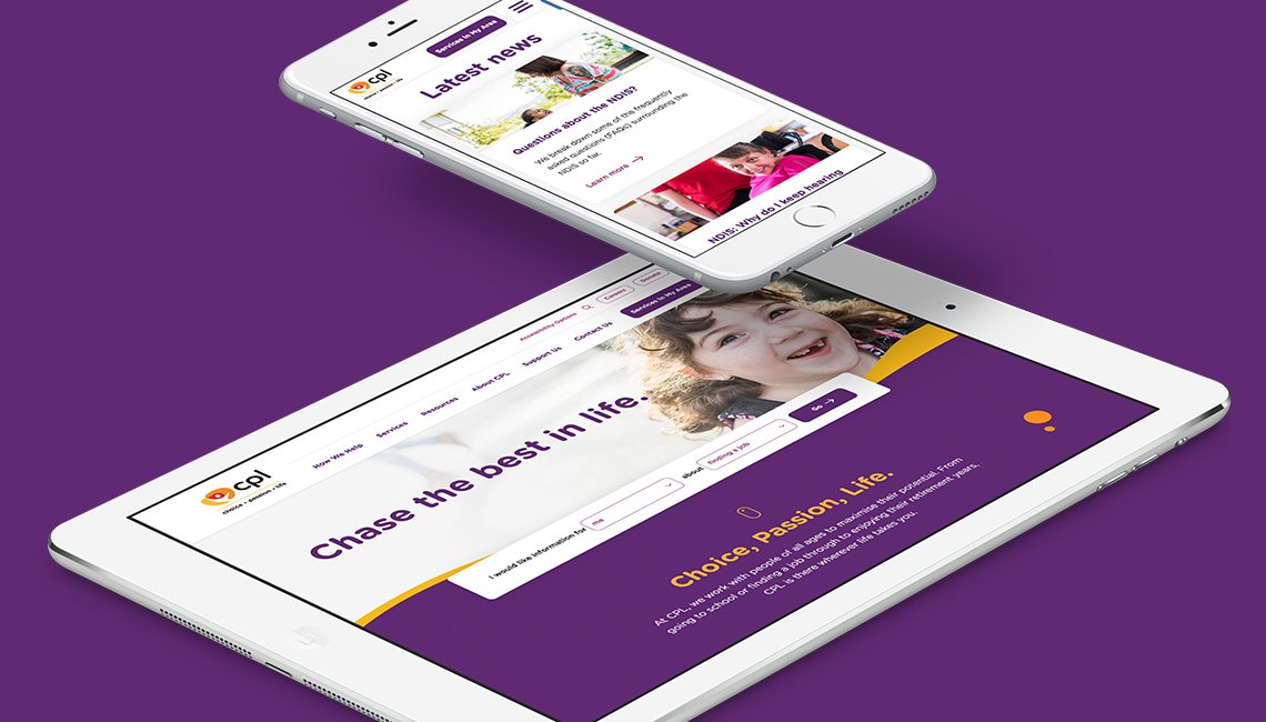
To bolster their new branding, we sought to deliver a clean, vibrant and contemporary look and feel that conveyed the same passion and innovation that CPL has been bringing to the lives of carers and care recipients since 1948.

The solution
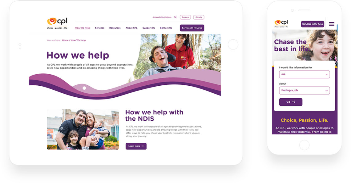
With a focus on improving user experience, we worked in close collaboration with CPL to develop a new information architecture that condensed the number of pages on the site, using a logical navigation that spoke to the needs and wants of a diverse audience. An example of this was the newly created ‘how we help’ section of the site, which sought to streamline content across key client demographics, from ‘newly diagnosed’ to ‘seniors’. As a result, access to key information is more direct, with answers to questions available at any stage of the life journey.
With a number of new brand elements having been created, we sought to infuse these into the design of the site as prominently as possible. As such, the quicksilver element is a distinct feature on each page, assisting the contemporary look and feel of the site. Moreover, the renewed colour palette was applied effectively across content blocks and was coupled with a strong focus on photography to create a space that walks the line between corporate and playful.

With regards to content, we created a greater ease of use for content editors in the future, while maintaining a strong focus on design. We did this by implementing a suite of flexible content blocks that helped with readability and aided the overall presentation and purpose of each page.
With a strong user driven approach, we made access to key content as efficient as possible through the use of natural language search on the site, catering to both caregivers and care recipients across a number of key service areas. Additionally, a ‘services in my area’ tool allowed for users to search by postcode or suburb to see a refined list of services available near to them. This was key to highlighting that clients didn’t have to travel to receive care, but could book in a service based on their location.
When it came to development, in order to deliver a truly bespoke design, Drupal 8 was the optimal choice. With great scalability, custom module development capability and extensibility, as well as ease of content publishing through the inline editor, a positive evolution for the life of the site was guaranteed.

The outcomes
While the site has only recently launched, positive sentiment has been received from the internal team at CPL. The site works as a great extension to their brand and is expected to drive positive engagement into the future.