The challenge
Riding on the promise of Google’s former ‘Google Earth Enterprise Server’; in 2015, the Queensland Government made the decision to provide their geolocated data through the Department of Natural Resources and Mines (DNRM), launching ‘The Queensland Globe’. When this enterprise level offering reached its end of life, the DNRM were determined to maintain the momentum of the globe, proactively seeking alternative cloud based options.
Seeking outside advice from industry experts, DNRM commissioned a report which identified opportunities for long-term development for the Queensland Globe from a user experience perspective.

It was observed that the Queensland Globe was a success story that required human resource effort to be maintained given its large number of layers. While DNRM had been releasing new data, this had given rise to increasing complexity, with customised globes adding another layer of congestion and confusion for users; and while it was perceived as a ‘point of truth’ for many, there were many data and historical image limitations.
Filling the gap left by Google’s retired offering; Esri, an International supplier of geographic information system software, web GIS and geodatabase management applications saw the potential of the Queensland Globe and approached JSAcreative to lend our UX and UI capabilities to help the solid groundwork laid by DNRM achieve greater success.

Our Solution
To help The Queensland Globe reach more users, we made it our goal to make the intelligent data built into the product as accessible and intuitive as possible without reducing the rich quality of the product.
The original version of The Globe had largely catered to advanced users with a sound knowledge of reading geospatial data and had little difficulty navigating the layers and properties built into it; but to garner a wider user base, the product required UX and UI attention.
We began by investigating the wide range of audiences that would have an interest in using the product and sought to reevaluate the navigation capabilities to make it as intuitive as possible for all users. Additionally, we were determined to simplify the rich data that had been embedded in the products ‘Globes’ feature (groupings of different layers around a specific theme), by creating topical segments such as recent flood data that would serve the interests of a broader spectrum of users from business owners to builders alike.

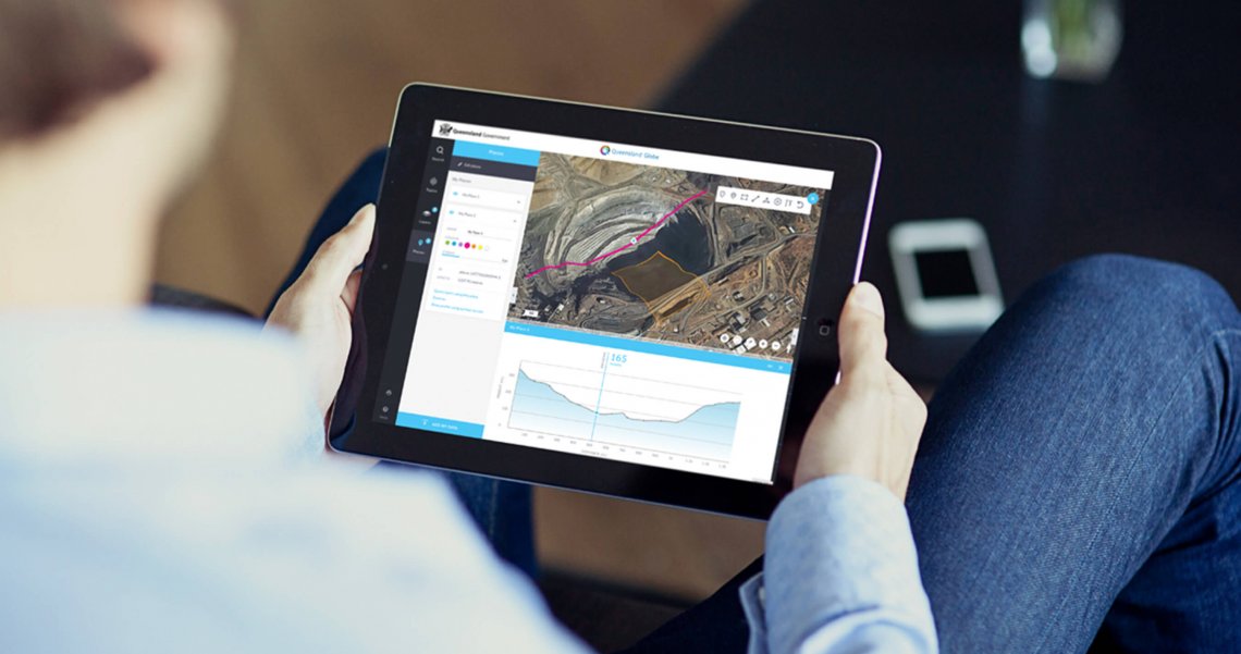
When it came to User Interface design, we again set our sights on accessibility, ensuring that the new Queensland Globe could be scaled to all screens including mobile, thereby increasing usage and positioning the product as technically progressive beyond desktop devices alone.
We ensured that the result was maximised for usability by working collaboratively with the DNRM who took a working beta of the new Queensland Globe on a roadshow, gathering feedback which was provided to our team, resulting in a number of iterative improvements.

The outcome
Through lending our UX and UI expertise, we were able to simplify the experience of navigating geospatial data for a wider spectrum of users without reducing any of the intelligence that had been built into the original Globe. Furthermore, by migrating the Globe to Esri, the Queensland Globe was able to extend beyond its past as a purely desktop product, leveraging the experience and expertise of Esri as an industry leader to bring their offering to the cloud, making it accessible to a wider audience across multiple devices, and ultimately reducing the barrier of entry.